
User Guide
MacroDrivers Dashboard User Guide: Overview Tab
The Overview Tab is your starting point for quickly grasping the current market landscape. It presents a concise summary of critical market conditions, allowing you to gauge sentiment and identify significant currency movements at a glance.
Panels within the Overview Tab:
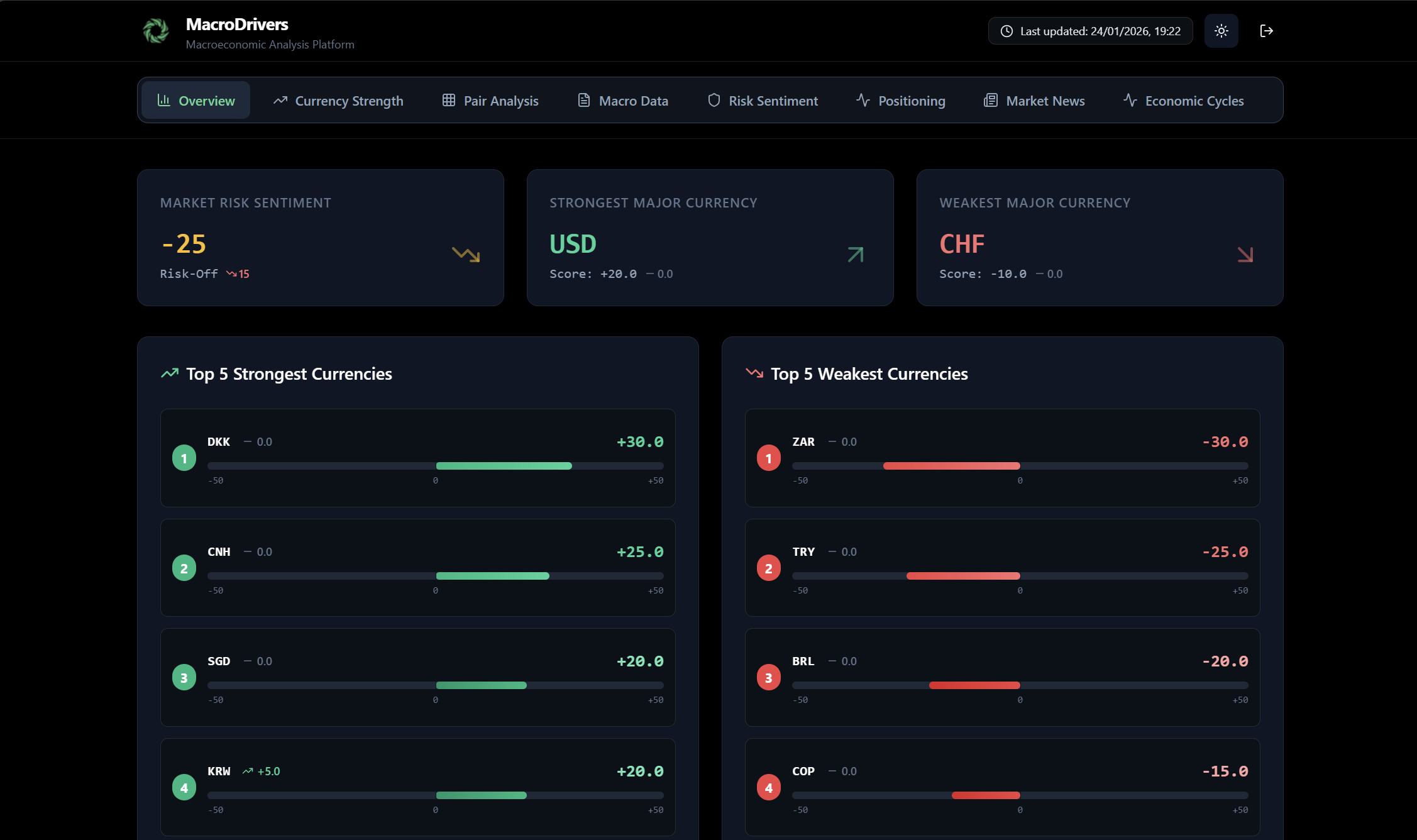
- Market Risk Sentiment Panel
- Purpose: This panel provides a quick assessment of global market risk appetite.
- Key Information:
- Risk Score: A numerical value ranging from -100 to +100.
- Positive values (e.g., +50, +80) indicate a “Risk-On” environment, suggesting investors are confident and willing to take on more risk. The text will show Risk-On.
- Negative values (e.g., -30, -60) indicate a “Risk-Off” environment, suggesting investors are cautious or fearful and prefer safer assets. The text will show Risk-Off.
- Values close to zero (e.g., between -20 and +20) will indicate a Neutral sentiment.
- Trend Indicator: An arrow (↑ or ↓) and a number next to the score show how much the risk sentiment has changed since the last update.
- Green Up Arrow (↑): Risk sentiment has improved (moved more towards Risk-On).
- Red Down Arrow (↓): Risk sentiment has deteriorated (moved more towards Risk-Off).
- Grey Dash (-): No significant change in risk sentiment.
- Risk Score: A numerical value ranging from -100 to +100.
- Visual Cue: A larger arrow (green for Risk-On, red for Risk-Off) provides an immediate visual summary of the overall sentiment direction.
- Strongest Major Currency Panel
- Purpose: Highlights the major currency (e.g., USD, EUR, GBP, JPY, CHF, CAD, AUD, NZD) that is currently exhibiting the most fundamental strength.
- Key Information:
- Currency Code: The three-letter code of the strongest major currency (e.g., USD).
- Score: The exact strength score of this currency.
- Trend Indicator: Shows the change in the currency’s strength score since the previous period.
- Visual Cue: A prominent green arrow pointing upwards indicates its strong status.
- Weakest Major Currency Panel
- Purpose: Identifies the major currency currently displaying the most fundamental weakness.
- Key Information:
- Currency Code: The three-letter code of the weakest major currency (e.g., JPY).
- Score: The exact strength score of this currency.
- Trend Indicator: Shows the change in the currency’s strength score since the previous period.
- Visual Cue: A prominent red arrow pointing downwards indicates its weak status.
- Top 5 Strongest Currencies List
- Purpose: Displays a ranked list of the five currencies with the highest calculated strength scores from the entire set of monitored currencies.
- Key Information:
- Rank: A number (1st to 5th) indicating its position.
- Currency Code: The three-letter code.
- Currency Strength Bar: A visual bar showing the currency’s strength score (from -50 to +50) and its change from the previous period. The bar’s color will reflect its strength (green for strong, red for weak).
- Top 5 Weakest Currencies List
- Purpose: Displays a ranked list of the five currencies with the lowest calculated strength scores from the entire set of monitored currencies.
- Key Information:
- Rank: A number (1st to 5th) indicating its position among the weakest.
- Currency Code: The three-letter code.
- Currency Strength Bar: A visual bar showing the currency’s strength score and its change.
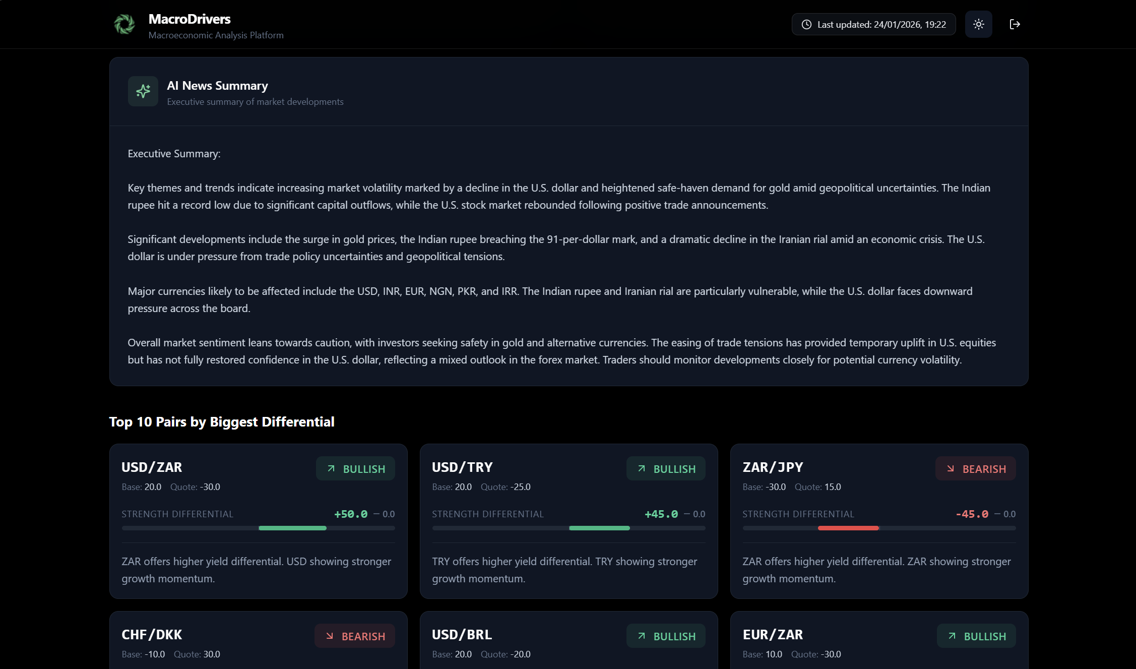
- AI News Summary Panel
- Purpose: Provides a brief, AI-generated executive summary of the most important market news and developments, designed to give you a quick overview without needing to read numerous articles.
- Benefit: Helps you grasp the narrative influencing the markets concisely.
- Top 10 Pairs by Biggest Differential
- Purpose: This section highlights currency pairs that exhibit the most significant fundamental divergence (difference in strength scores) between their base and quote currencies. These are often considered prime candidates for potential trading opportunities.
- Key Information for each Pair Card:
- Pair Name: The standard currency pair notation (e.g., EUR/USD, USD/JPY).
- Bias: A clear indication of the pair’s directional bias:
- Bullish: The base currency is significantly stronger than the quote currency, suggesting potential upward movement for the pair.
- Bearish: The base currency is significantly weaker than the quote currency, suggesting potential downward movement for the pair.
- Neutral: No significant difference in strength, or factors are balanced.
- Differential: The numerical difference between the base currency’s strength score and the quote currency’s strength score. A larger absolute value indicates a stronger bias.
- Explanation: A short, AI-generated summary explaining the core macro reasons behind the observed bias (e.g., “Macro divergence of X points based on composite fundamentals”, “USD offers higher yield differential”).
- Scores: Displays the individual strength scores for both the base and quote currencies, along with their previous scores for context.
MacroDrivers Dashboard User Guide: Strength Tab

The Strength Tab provides an in-depth analysis of individual currency strengths and their relative positioning against each other. This section is crucial for identifying which currencies are fundamentally strong or weak, and for spotting potential trading opportunities based on macro divergence.
Panels within the Strength Tab:
- Currency Strength Model Panel
- Purpose: This panel presents a ranked list of all monitored currencies based on their calculated fundamental strength.
- Description: At the top, you’ll find a brief explanation of the proprietary scoring system, which assigns a score from –50 (extreme weakness) to +50 (extreme strength) by analyzing macroeconomic fundamentals across multiple dimensions.
- Key Information:
- Ranked List: All currencies are listed in descending order of strength, from the strongest at the top to the weakest at the bottom.
- Rank Number: Each currency is prefaced with its numerical rank (e.g., 1, 2, 3). The strongest currency will have rank 1, and the weakest will have the highest rank number.
- Currency Strength Bar: For each currency, you’ll see a visual bar that dynamically represents its strength score.
- The bar is centered at zero, extending left for negative scores (weakness) and right for positive scores (strength).
- Color Coding: The bar’s color will transition from shades of red (weak) through gray (neutral) to shades of green (strong).
- Score Value: The exact strength score is displayed numerically, formatted with a + for positive scores (e.g., +35.2) and a – for negative scores (e.g., -28.7).
- Score Change: An arrow (↑, ↓, or –) and a number indicate how much the currency’s strength score has changed since the previous data update. This helps you quickly see if a currency is gaining or losing momentum.
- Green Up Arrow (↑): Strength score has increased.
- Red Down Arrow (↓): Strength score has decreased.
- Grey Dash (–): No change.
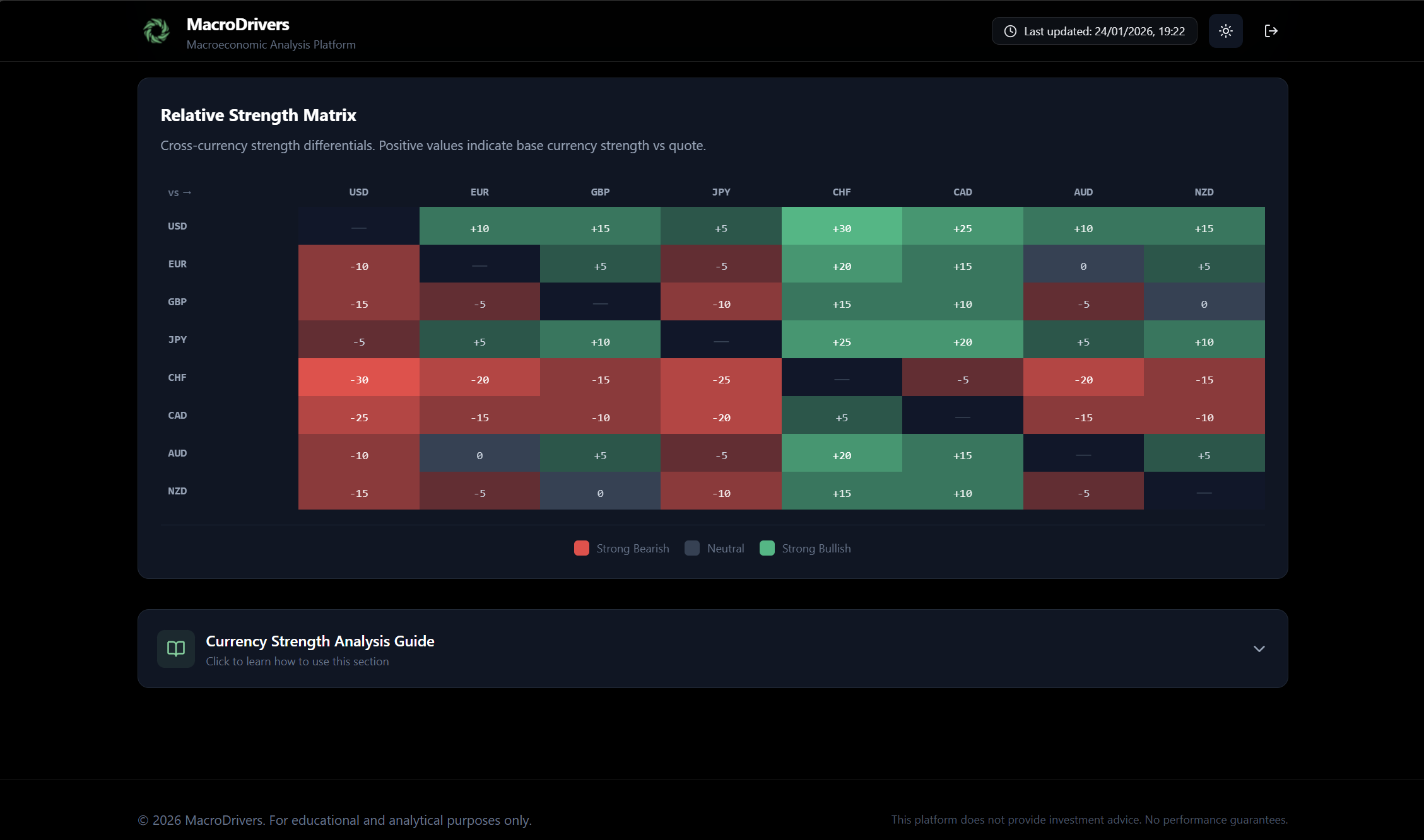
- Relative Strength Matrix (Heatmap)
- Purpose: This powerful visual tool allows you to quickly identify strength differentials between any two currencies, highlighting potential relative value trades.
- Description: A brief explanation clarifies that positive values in the matrix indicate the base currency (row) is stronger than the quote currency (column), and vice versa.
- Heatmap Grid:
- Rows and Columns: The grid has currency codes as both row and column headers. Each cell represents a currency pair.
- Value in Cell: The number in each cell shows the differential between the strength score of the row currency and the column currency.
- A value of +15 in the EUR (row) / USD (column) cell means EUR is 15 points stronger than USD.
- A value of -10 in the GBP (row) / JPY (column) cell means GBP is 10 points weaker than JPY.
- Color Coding:
- Green Cells: Indicate a positive differential, meaning the base currency (row) is stronger than the quote currency (column). Darker shades of green represent larger positive differentials.
- Red Cells: Indicate a negative differential, meaning the base currency (row) is weaker than the quote currency (column). Darker shades of red represent larger negative differentials.
- Grey/Neutral Cells: Indicate a small or zero differential, suggesting balanced strength between the pair.
- Diagonal: The diagonal cells (e.g., USD/USD) are typically left blank or marked with a dash, as a currency has no differential against itself.
- How to Use: Look for deeply green cells (strong base vs. weak quote) or deeply red cells (weak base vs. strong quote) to identify currency pairs with significant fundamental imbalances, which often lead to sustained trends.
MacroDrivers Dashboard User Guide: Pairs Tab

The Pairs Tab is designed for traders who want to analyze the fundamental bias of specific currency pairs. It groups pairs into logical categories and provides a concise view of their directional predisposition based on the underlying strength of their component currencies. This tab helps you quickly identify which pairs are fundamentally supported for a bullish or bearish move.
Panels within the Pairs Tab:
- Pair Group Selector
- Purpose: This interactive section allows you to filter and view currency pairs based on predefined categories, making it easier to focus on specific market segments.
- How to Use:
- You will see a series of clickable buttons at the top of the tab (e.g., Majors, Minors (Crosses), Scandinavian, Asian, Latin America, EMEA).
- Clicking on any of these buttons will dynamically update the cards below to show only the pairs belonging to that group.
- The currently selected group button will be highlighted, and it will also show the total number of pairs within that group in a small badge (e.g., (7)).
- Currency Pair Bias Cards (Displayed based on selected Pair Group)
- Purpose: These individual cards provide a focused analysis for each currency pair within the selected group, detailing its fundamental bias and the reasons behind it.
- Key Information for each Card:
- Pair Name: The standard three-letter currency codes separated by a slash (e.g., EUR/USD, GBP/JPY). The first currency is always the Base Currency, and the second is the Quote Currency.
- Bias: A clear indication of the pair’s fundamental directional bias:
- Bullish: The Base Currency is fundamentally stronger than the Quote Currency. This suggests a potential upward movement for the pair (e.g., EUR/USD Bullish means EUR is stronger than USD).
- Bearish: The Base Currency is fundamentally weaker than the Quote Currency. This suggests a potential downward movement for the pair (e.g., GBP/USD Bearish means GBP is weaker than USD).
- Neutral: The fundamental strengths of the Base and Quote Currencies are relatively balanced, or the difference is not significant enough to warrant a strong bias.
- Differential: A numerical value representing the difference between the Base Currency’s strength score and the Quote Currency’s strength score.
- A positive differential supports a Bullish bias for the pair.
- A negative differential supports a Bearish bias for the pair.
- The magnitude of the number indicates the strength of the divergence.
- Explanation: A concise, AI-generated sentence or two summarizing the primary macro factors contributing to the pair’s current bias. This helps you understand why a pair has a certain bias. For example: “USD offers higher yield differential,” or “EUR showing stronger growth momentum.”
- Base Score: The individual strength score of the Base Currency (e.g., the EUR score in EUR/USD).
- Quote Score: The individual strength score of the Quote Currency (e.g., the USD score in EUR/USD).
- Previous Base Score & Previous Quote Score: These values provide historical context, allowing you to see if the component currencies are strengthening or weakening relative to their past performance.
Understanding the Pair Groups:
- Majors: These are the most liquid currency pairs, typically involving the US Dollar (USD) and other major G10 currencies (EUR, GBP, JPY, CHF, CAD, AUD, NZD).
- Minors (Crosses): These are G10 currency pairs that do not include the US Dollar (e.g., EUR/GBP, EUR/JPY, AUD/CAD). They offer insights into relative strength among non-USD major currencies.
- Scandinavian: Focuses on pairs involving the Norwegian Krone (NOK), Swedish Krona (SEK), and Danish Krone (DKK). These currencies are often influenced by commodity prices and regional European dynamics.
- Asian: Includes currency pairs from key Asian economies such as the Chinese Yuan (CNH), Singapore Dollar (SGD), South Korean Won (KRW), Indian Rupee (INR), Thai Baht (THB), and New Taiwan Dollar (TWD).
- Latin America: Covers emerging market currency pairs from Latin America, including the Brazilian Real (BRL), Mexican Peso (MXN), Chilean Peso (CLP), and Colombian Peso (COP).
- EMEA: Encompasses emerging market currency pairs from Europe, the Middle East, and Africa, such as the South African Rand (ZAR), Turkish Lira (TRY), Polish Zloty (PLN), Hungarian Forint (HUF), Czech Koruna (CZK), and Israeli Shekel (ILS).
MacroDrivers Dashboard User Guide: Macro Data Tab
The Macro Data Tab is your go-to section for a granular, comparative view of key economic indicators across various currencies. This tab helps you understand the fundamental health and policy stance of different economies, which is crucial for assessing their currency’s underlying value and potential direction.
Panels within the Macro Data Tab:
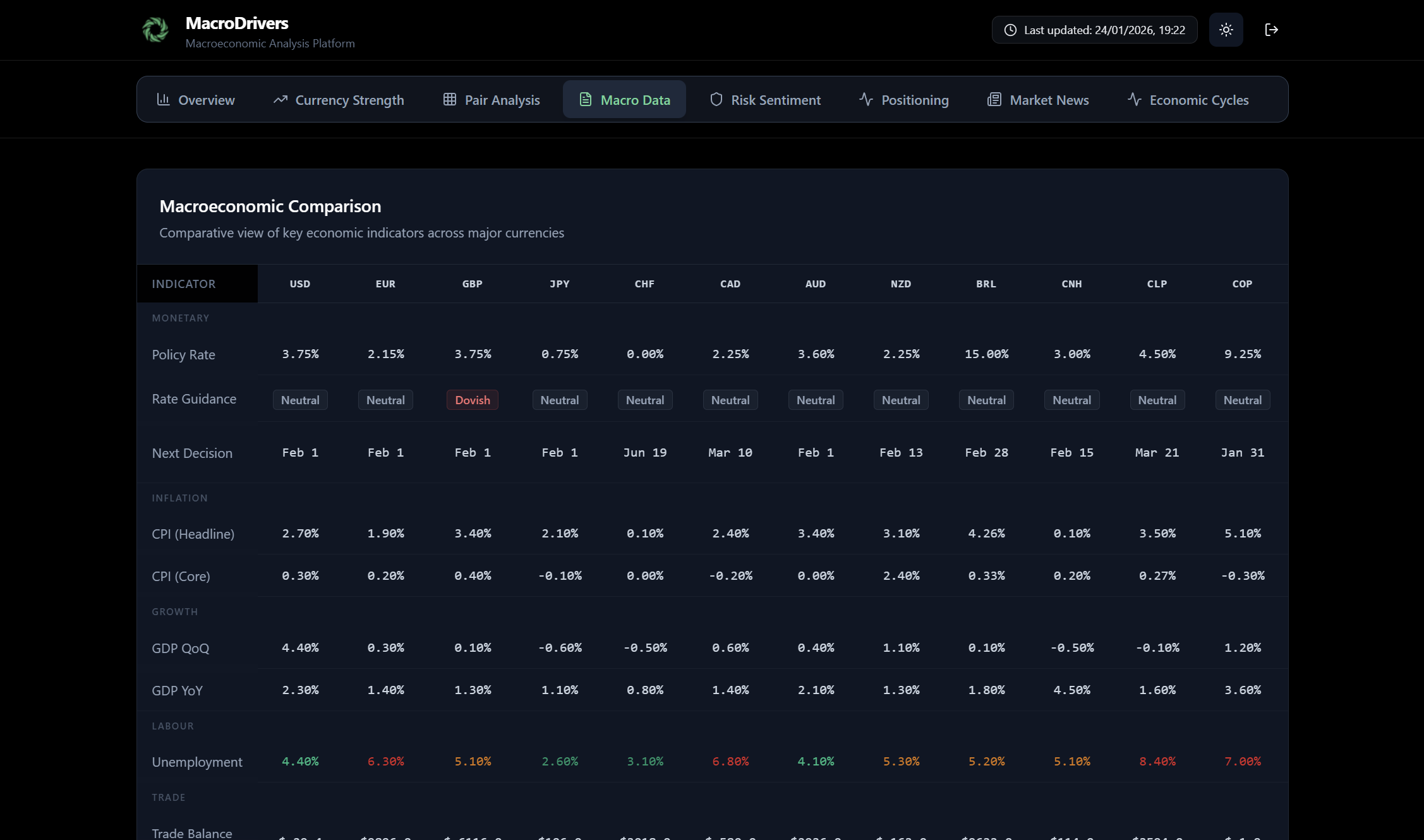
- Macroeconomic Comparison Table
- Purpose: This panel provides a comprehensive, side-by-side comparison of essential macroeconomic indicators for all monitored currencies. It allows for quick identification of countries that are outperforming or underperforming on specific metrics.
- Key Information:
- Rows: Each row represents a specific macroeconomic indicator (e.g., GDP Growth (QoQ), Inflation (Headline CPI), Policy Rate, Unemployment Rate, Manufacturing PMI, Services PMI, Trade Balance, Fiscal Balance).
- Columns: Each column represents a currency (e.g., USD, EUR, GBP, JPY, CHF).
- Values: The cells display the latest numerical data for each indicator for the respective currency.
- Visual Cues:
- Color Coding: Values are intelligently color-coded to instantly highlight performance.
- Green hues often indicate strong or favorable economic conditions (e.g., high GDP growth, low unemployment, strong PMI).
- Red hues might indicate weaker or unfavorable conditions (e.g., negative GDP growth, high inflation, weak PMI).
- Neutral colors for values within expected ranges or where a clear positive/negative isn’t applicable.
- Rate Guidance: For indicators like “Policy Rate,” you might also see text-based guidance (e.g., “hawkish,” “dovish,” “neutral”) from the central bank, providing context on future policy direction.
- Color Coding: Values are intelligently color-coded to instantly highlight performance.
- How to Use: Scan rows to compare a single indicator across all currencies, or scan columns to see the overall economic picture for a specific currency. This helps in identifying fundamental divergences that can drive currency pair movements.

- Currency Commentary Section
- Purpose: This interactive section provides in-depth qualitative and quantitative analysis for a single, selected currency. It consolidates crucial information about the currency’s central bank, macroeconomic trends, and specific risks or tailwinds.
- How to Use:
- Currency Selector: Above the commentary card, you’ll find a row of clickable buttons, each labeled with a currency code (e.g., USD, EUR, GBP). Click on any currency button to load its specific commentary. The selected currency button will be highlighted.
- Commentary Card: Once a currency is selected, this card will display its detailed breakdown:
- Central Bank Stance: Provides information on the country’s central bank (e.g., “Federal Reserve – Neutral Stance”).
- Hawkish: Indicates the central bank is likely to raise interest rates or maintain a tight monetary policy to combat inflation.
- Dovish: Indicates the central bank is likely to cut interest rates or pursue a loose monetary policy to stimulate economic growth.
- Neutral: Indicates a balanced stance, with no immediate bias towards tightening or easing.
- Macro Trends: A concise summary of the most significant macroeconomic trends affecting the currency. This might include:
- GDP Growth: Commentary on whether the economy is expanding rapidly, slowing down, or in recession.
- Inflation Dynamics: Insights into whether inflation is rising, falling, or stable, and its implications.
- Labor Market: Assessment of employment conditions, wage growth, and unemployment trends.
- Trade: Overview of the country’s trade balance and its impact on the currency.
- Next Rate Decision: If available, the date of the next scheduled central bank meeting where interest rates might be reviewed.
- Key Risks/Tailwinds: Highlights specific factors that could positively (tailwinds) or negatively (risks) impact the currency in the near to medium term. This could include geopolitical events, commodity price changes, or significant policy shifts.
- Central Bank Stance: Provides information on the country’s central bank (e.g., “Federal Reserve – Neutral Stance”).
MacroDrivers Dashboard User Guide: Risk Tab

The Risk Tab is dedicated to providing a comprehensive overview of global market risk sentiment. Understanding the prevailing risk appetite (whether investors are in “Risk-On” or “Risk-Off” mode) is fundamental for making informed trading decisions and assessing market conditions.
Panels within the Risk Tab:
- Risk Gauge
- Purpose: This is the central feature of the Risk Tab, offering an immediate and clear visual representation of the current global risk sentiment.
- Key Information:
- Gauge Display: A large, intuitive gauge visually indicates the risk score.
- The gauge spans from -100 (extreme Risk-Off) to +100 (extreme Risk-On).
- The needle’s position on the gauge reflects the current risk_score.
- Color Coding: The gauge will likely be colored to visually reinforce the sentiment:
- Shades of red/orange towards the left for “Risk-Off.”
- Shades of green/blue towards the right for “Risk-On.”
- A neutral zone in the middle.
- Risk Score: The precise numerical value of the current global risk sentiment (e.g., +45, -22).
- Previous Score: The previous_risk_score is displayed, allowing you to see how much the sentiment has shifted since the last update.
- Summary: A concise, AI-generated summary provides a textual explanation of the current risk conditions, offering qualitative context to the numerical score. This might describe factors driving the sentiment.
- Gauge Display: A large, intuitive gauge visually indicates the risk score.
- How to Use: Quickly assess whether the market is favoring riskier assets (Risk-On) or shying away from them (Risk-Off). Monitor the movement of the needle and the summary for changes in the overall market mood.
- Risk Components Panels
- Purpose: These individual cards break down the overall risk sentiment into its contributing factors, offering deeper insights into what is driving the market’s risk appetite.
- Key Information for each Card:
- Equity Trend:
- Label: Equity Trend
- Value: Indicates the prevailing trend in global equity markets.
- Possible Values: Bullish, Neutral, Bearish.
- Color Coding: Often displayed with green for bullish, red for bearish, and a neutral color for neutral.
- Volatility Level:
- Label: Volatility Level
- Value: Describes the current state of market volatility.
- Possible Values: Low, Moderate, Elevated, High.
- Color Coding: Typically, green for low, yellow/amber for moderate/elevated, and red for high.
- Safe-Haven Demand:
- Label: Safe-Haven Demand
- Value: Assesses the current demand for traditional safe-haven assets (like Gold, JPY, CHF).
- Possible Values: Weak, Moderate, Strong.
- Color Coding: Often displayed with green for weak demand (Risk-On), and amber/red for strong demand (Risk-Off).
- Yield Dynamics:
- Label: Yield Dynamics
- Value: Provides a brief description of the current movements and trends in key bond market yields, which are often indicators of investor sentiment and economic expectations.
- Example Values: Could be descriptive text like “Rising 10Y yields,” “Stable bond market,” or “Falling long-term yields.”
- Color Coding: Generally, a neutral color.
- Equity Trend:
- How to Use: These panels help you understand the underlying drivers of the overall risk score. For instance, a “Risk-Off” score might be accompanied by a “Bearish” equity trend, “High” volatility, and “Strong” safe-haven demand. Analyzing these components together provides a more complete picture of market psychology.
MacroDrivers Dashboard User Guide: Sentiment Tab

The Sentiment Tab provides an in-depth look into market positioning and sentiment across various asset types (individual currencies, currency pairs, and crosses). Understanding sentiment can offer contrarian trading opportunities or confirm existing trends, as markets often overextend in one direction.
Panels within the Sentiment Tab:
- Market Sentiment Overview
- Purpose: This panel presents a consolidated view of market sentiment data, categorized by asset type, allowing you to gauge whether traders are bullish, bearish, or neutral on various instruments.
- How to Use:
- View Selector: You’ll find buttons or tabs (e.g., Currencies, Pairs, Crosses) that allow you to switch between different asset types. Selecting one will filter the displayed sentiment cards.
- Data Refresh: There’s an option to manually refresh the sentiment data to ensure you’re viewing the latest available positioning.
- Sentiment Cards: Each card within this section represents a specific currency, pair, or cross, and provides a breakdown of its sentiment:
- Asset Code: The identifier for the asset (e.g., USD, EUR/USD, EUR/JPY).
- Sentiment Score: A numerical score, typically ranging from -100 (extreme bearish) to +100 (extreme bullish), indicating the overall market sentiment for that asset.
- Positioning: A qualitative description of the market’s current stance on the asset: Extreme Bullish, Bullish, Neutral, Bearish, Extreme Bearish.
- Net Long Percentage: If available, this shows the percentage of traders currently holding net long positions in the asset, providing a quantifiable measure of bullishness.
- COT Data: A brief summary of the Commitments of Traders (COT) report data, which reflects the positioning of large institutional traders.
- Retail Sentiment: Insights into the sentiment of retail traders, which can sometimes be a contrarian indicator.
- Contrarian Signal: A boolean indicator (Yes/No) suggesting whether the current sentiment might represent a contrarian trading opportunity (e.g., extreme bullish sentiment might signal a potential reversal).
- Summary: A concise, AI-generated summary explaining the key drivers behind the current sentiment for that specific asset.
- Date: The date when the sentiment data was last updated.
Key Concepts and How to Interpret:
- Sentiment Score (-100 to +100): A higher positive score indicates a stronger bullish sentiment, while a lower negative score indicates stronger bearish sentiment. Scores near zero suggest neutral positioning.
- Contrarian Trading: When sentiment reaches extreme levels (e.g., Extreme Bullish or Extreme Bearish), it can sometimes signal that a market is overextended and due for a reversal. The Contrarian Signal helps identify such potential opportunities.
- COT Data: Often seen as a more reliable indicator for longer-term trends, as it reflects the positioning of professional traders who tend to have better insights and resources.
- Retail Sentiment: Can be a useful contrarian indicator; if a vast majority of retail traders are on one side of a trade, the smart money might be on the other.
By combining the quantitative sentiment scores with the qualitative descriptions and the contrarian signal, you can gain a deeper understanding of market psychology and identify potential imbalances that could lead to future price movements.
MacroDrivers Dashboard User Guide: News Tab
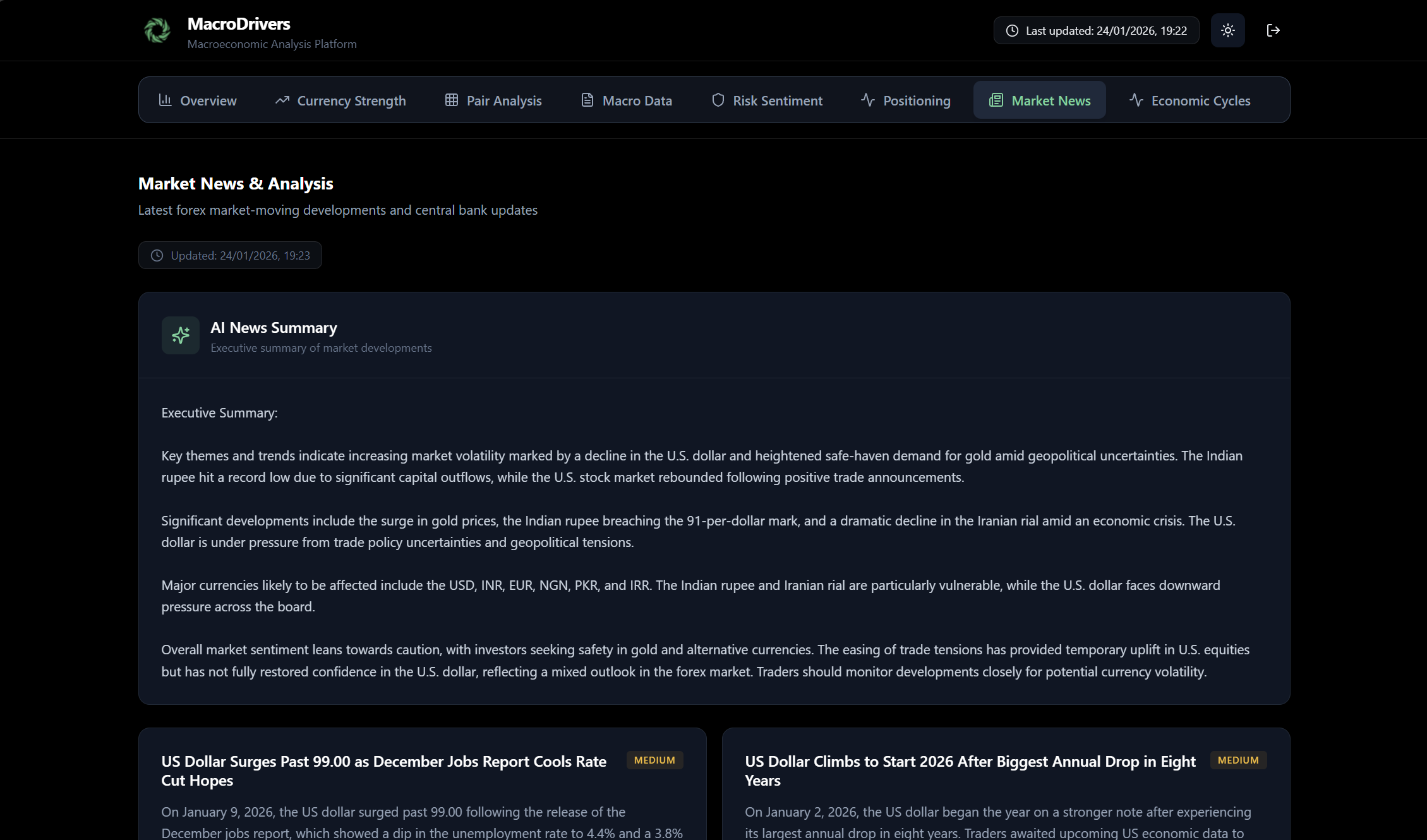
The News Tab provides a dynamic feed of market news, along with AI-generated summaries, to keep you informed about the latest developments impacting currency markets. Staying on top of news events is critical, as they can trigger significant price movements.
Panels within the News Tab:
- AI News Summary Panel
- Purpose: This panel offers a concise, AI-generated summary of the most important recent market news, designed to give you a quick overview without having to read every single headline.
- Key Information:
- Summary Text: The main content is a paragraph or two of natural language text, synthesizing the key takeaways from recent news articles.
- Generated Date/Time: Indicates when the summary was last generated, ensuring you know how current the information is.
- Refresh Button: Allows you to manually trigger a re-generation of the AI summary to get the latest perspective.
- How to Use: Use this panel for a rapid digest of market events. It’s especially useful for busy traders who need to quickly grasp the overall market narrative.
- Market News Feed
- Purpose: This section lists individual news articles, providing headlines, summaries, sources, and their potential impact on currencies.
- Key Information for each News Article:
- Headline: The main title of the news story.
- Summary: A brief overview of the article’s content.
- Source: The original publication or news agency (e.g., “Reuters,” “Bloomberg,” “Trading Economics”).
- Timestamp: The date and time when the news was published.
- Affected Currencies: A list of currency codes (e.g., USD, EUR, GBP) that are likely to be impacted by this news event. This helps you quickly filter for relevant news.
- Impact Level: An assessment of how significant the news is expected to be:
- High: Expected to have a substantial effect on market prices.
- Medium: Likely to cause some market reaction, but not as dramatic as high impact news.
- Low: Minor impact, usually for less significant events.
- How to Use:
- Detailed Insights: After reviewing the AI summary, you can delve into specific news articles that catch your attention.
- Currency-Specific Filtering: Look at the “Affected Currencies” to quickly identify news relevant to the pairs you are trading or monitoring.
- Impact Assessment: Prioritize reading news with “High” impact levels first, as these are most likely to move markets.
MacroDrivers Dashboard User Guide: Cycles Tab

The Cycles Tab offers a unique perspective on the economic health of various countries by categorizing them into different phases of the economic cycle. Understanding where an economy is in its cycle can provide valuable insights into its currency’s potential performance and future policy decisions.
Panels within the Cycles Tab:
- Economic Cycle Visualization
- Purpose: This panel visually represents the current economic cycle phase for each monitored currency. It groups currencies by their cycle phase, making it easy to identify broad economic trends across different regions.
- Key Information:
- Cycle Phases: The panel is structured around distinct economic cycle phases, such as:
- Late Expansion
- Mid Expansion
- Early Recovery
- Slowdown
- Contraction
- Currency Groupings: Under each cycle phase, you will see a list of currencies (e.g., USD, EUR) that are currently assessed to be in that specific phase.
- Cycle Score: Each currency will have an associated “Cycle Score” (typically ranging from -10 to +10). This numerical score quantifies the currency’s position within its economic cycle, with higher positive scores indicating stronger expansion and lower negative scores indicating deeper contraction.
- Previous Cycle Phase: For each currency, the previous cycle phase is shown. This helps to visualize the economic momentum – whether an economy is improving, deteriorating, or consolidating its position within a phase.
- Key Indicators: For each currency listed, key macroeconomic indicators relevant to its cycle position are displayed. These might include:
- GDP Growth: Quarterly or year-over-year growth rates, indicating the pace of economic expansion or contraction.
- Inflation: Headline or core inflation rates, reflecting price stability or pressures.
- Unemployment Rate: The percentage of the workforce that is unemployed, a key measure of labor market health.
- Policy Rate: The central bank’s benchmark interest rate, indicating monetary policy stance.
- PMI (Purchasing Managers’ Index): Manufacturing and/or Services PMI, providing insight into business activity and confidence.
- Trade Balance: The difference between exports and imports, showing a country’s external sector health.
- Cycle Phases: The panel is structured around distinct economic cycle phases, such as:
- Visual Cues:
- Color Coding: Cycle phases and individual currency indicators may use color coding to highlight their status (e.g., green for positive growth, red for contraction).
- Icons: Each cycle phase might be associated with a distinct icon to provide quick visual recognition.
- How to Use:
- Identify Global Trends: Quickly see if a majority of economies are in expansion or contraction, giving you a top-level view of the global economic climate.
- Spot Divergences: Compare the cycle phases of different currencies to identify fundamental divergences that could drive long-term currency trends. For example, if the EUR is in “Contraction” while the USD is in “Mid Expansion,” this suggests fundamental weakness for EUR against USD.
- Forecast Policy: The economic cycle often dictates central bank policy. Economies in “Contraction” or “Slowdown” are more likely to see dovish central bank stances, while those in “Expansion” might face hawkish pressures.